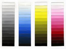
 One of the first things I talk about in my art classes (and then I harp on about it continually) is that it is so important to use a variety of values in your paintings. Most new painters tend to work in the middle values. In other words, if you look at a value scale of 1 -10 (light to dark) most people paint in the range of 4 thru 7. And if the blues, yellows, greens, reds, etc. that you use are all in that middle range then your painting will appear flat. You MUST get some really light and really dark values into each painting for it to be successful. And the way to do this is to practice.
I was reading through a Walter Foster Publication called The Daily Book of Art and found an interesting quote. Joseph Stoddard said that his friend and artist Marilyn Simandle told him that “color gets all the credit, but value does all the work”. I couldn’t have said it better myself. 🙂


But some colors come out of the tube at values toward the middle of the value scale. Adding white is a good way to tint color, but how about to darken it? Do you just add black?
You can add black but I usually add the opposite color on the color wheel to the color I want to darken. It keeps it to a more true color. For instance if I want a darker red I add a tiny touch of green.
hey, i am trying to get my students to know values with colors. What is a interesting way for this to practice this as a project? what do you do with your students for this topic?
We paint value scales starting with a color and adding a little white each time to try to make it lighter. We try to see if we can carry it out 10 values and get to almost white. I let the young students do this with the primary colors. We usually paint a color wheel in the same lesson.